AMBER LATHAM: ILLUSTRATION PORTFOLIOPuzzle-Break: Mascot Design & Site Illustrations
The client:
Puzzle-Break.com is a collection of logic puzzles that changes daily. It offers a sign up option which for a small payment allows users to unlock the whole library of puzzles.
The brief:
To design a ‘site mascot’ which would bring a distinct personality to the Puzzle-Break, and a point of difference from it’s competitors. This mascot would then feature in character illustrations across key touchpoints on the site and within the newsletter.
Following from this, the aim is to develop the UI elements of the site, such as different puzzle icons, to bring more themeing to the site’s individual puzzles and themeing as a whole.
Inspiration:
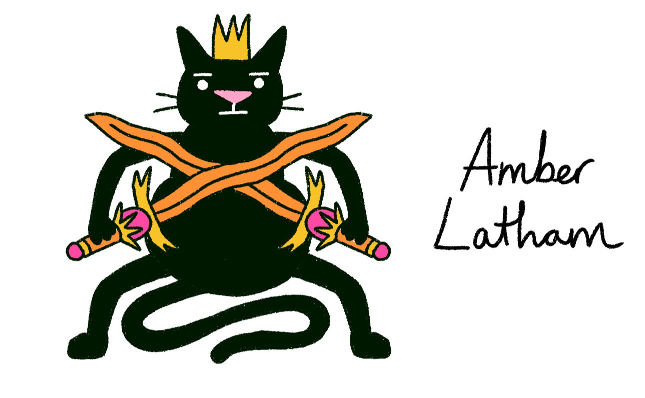
The client provided me with a detailed board of their different sources of inspiration, their initial thoughts for the mascot design, and the elements from my own body of work that they liked.
I have captured some of these notes into a condensed version here. Japan was a key influence, both for it’s strong use of ‘kawaii’ mascots, usually in the form of animals, and for its kissaten culture. Kissatens are Japanese coffee/tearooms with a retro, Parisian-inspired style and calm, cosy atmosphere. The client was keen to have a sense of this atmosphere translate through to the site.
Mascot development:
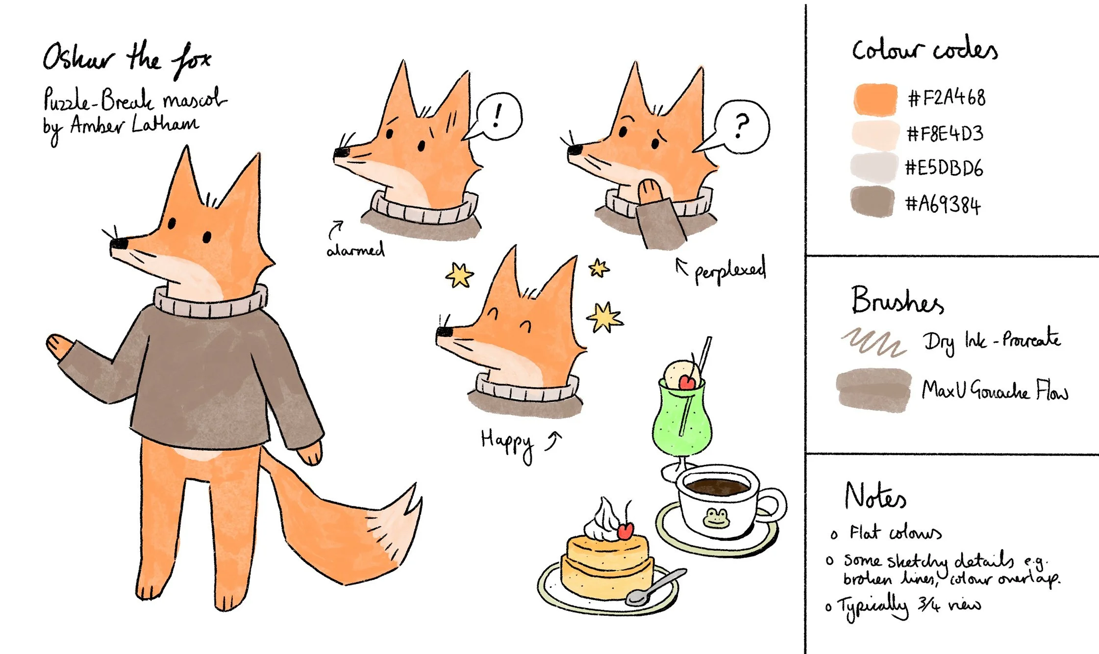
Below is an outline of the development stages we went through in designing the site mascot, as well as the finalised character sheet. We are now currently in the process of working through the spot illustrations featuring the mascot, Oskar, which will appear around the site.
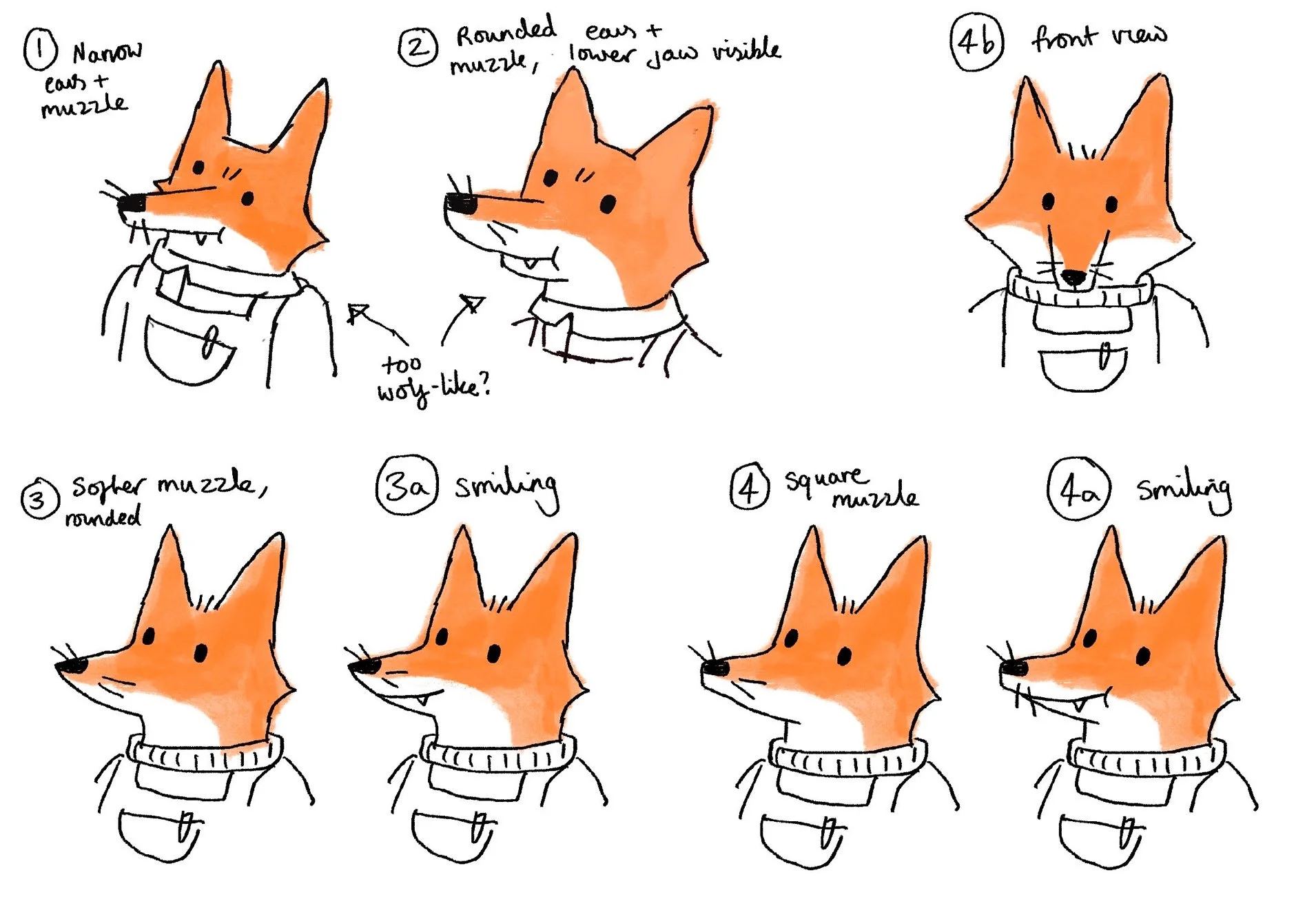
STAGE 1 - Face testing. We moved forward with style 4, the mouthless design and agreed that the character's emotions would be instead shown through their eyes, eyebrows, whiskers and emanata.
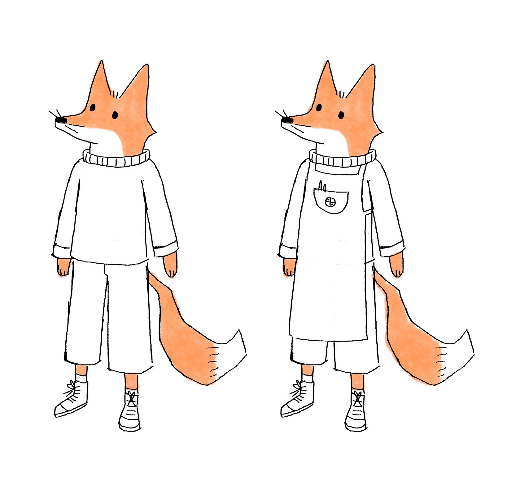
STAGE 2 - Body testing. My first draft shown above tested out a more human-like body with full clothing and shoes. The apron looks at the idea of the character being a Kissaten employee (vs a customer without). Feedback asked for the body to be simplified and shorter so that the character would take up less space.
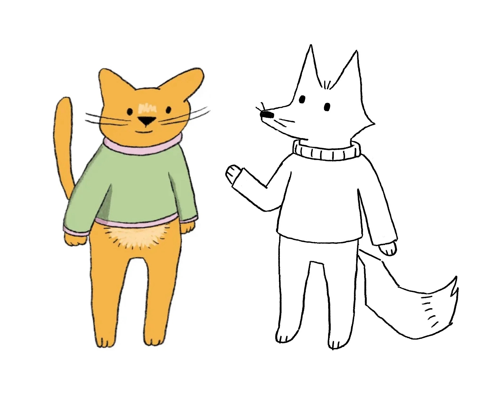
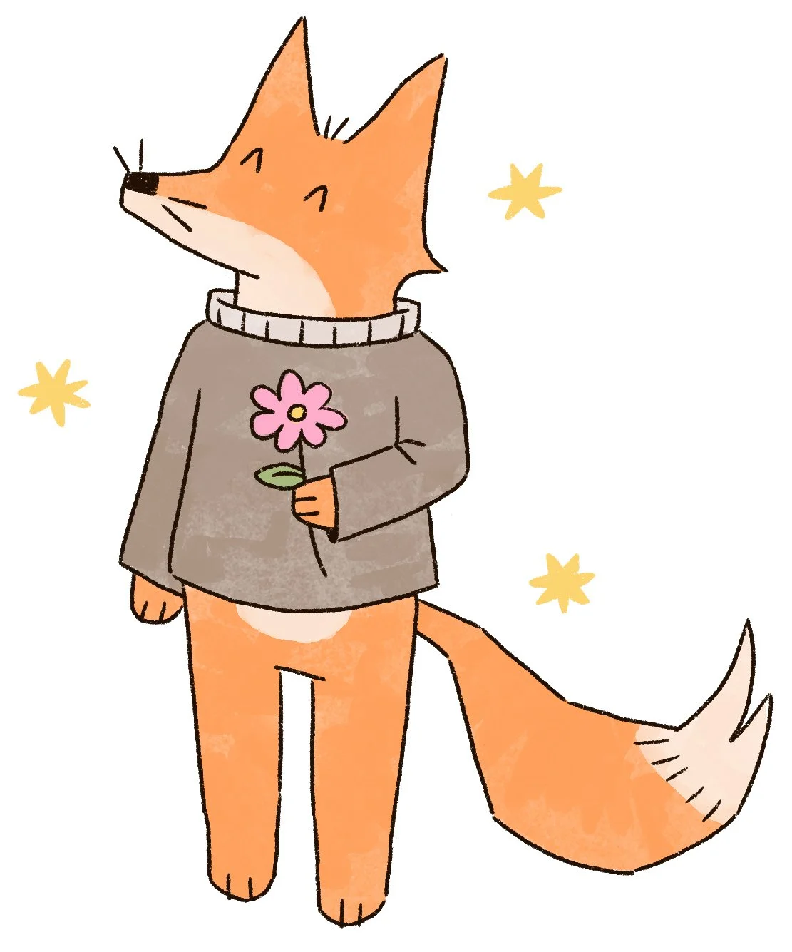
STAGE 3 - Body finalisation. The client provided an example from my previous work (the cat on the left) to show what they had in mind for their mascot, now named Oskar. On the right is my sketch showing Oskar's revised body design, which was approved.
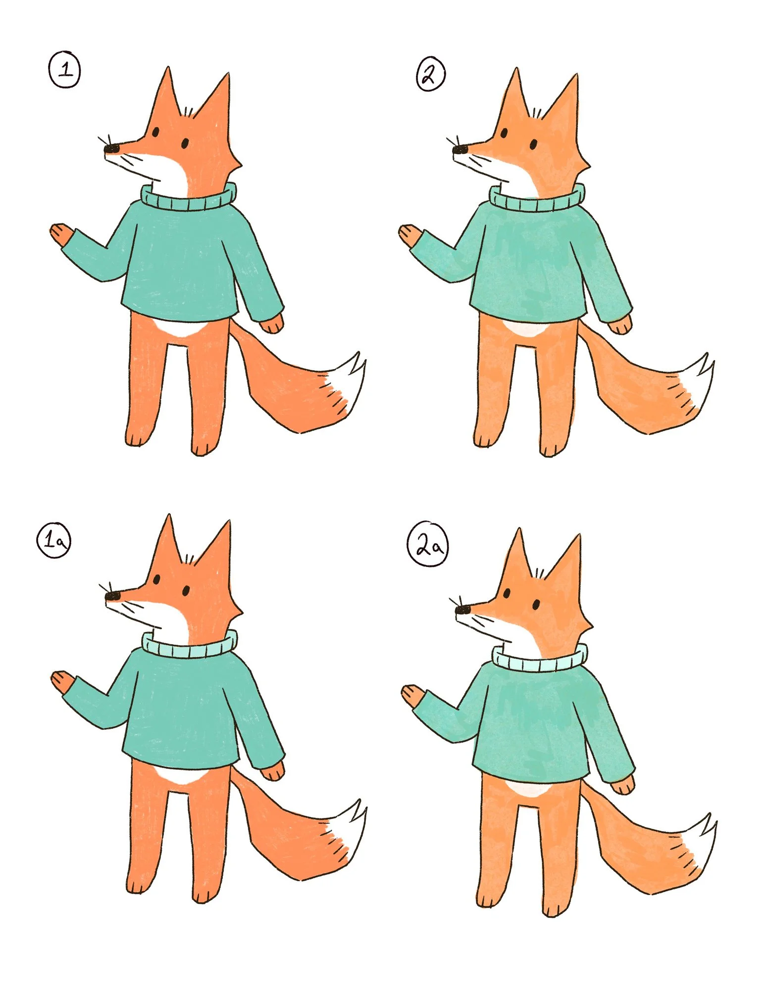
STAGE 4 - colour testing. Here are the four options I sent the client in regards to Oskar's colour palette and colour rendering. Those on the left are coloured with a flat colour, pencil style brush and those on the left with a gouache style brush for a subtle painterly effect. I also gave the option of having the collar a lighter shade or keeping the palette as minimal as possible. We moved forwards with version 2a.
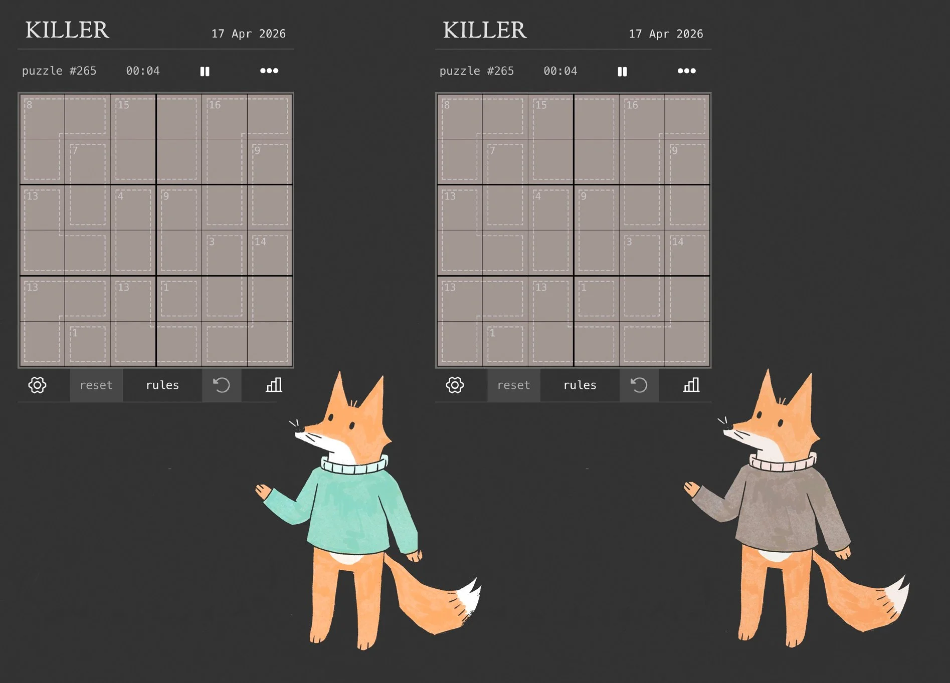
STAGE 5 - Dark mode testing. One of the mascot's requirements is that it works across Puzzle-Break's light and dark mode formats. In this mock-up (for colour testing only) I found that Oskar's design would be too bright and distracting, and so proposed a recolour to the subtler shades on the right, which was approved.